Many of us are familiar with the iconic business logos of famous brands. The brand logo design appeals to our senses and leaves an impression on us. We are bombarded with logos daily, but do we ever stop to look at them? The answer is probably not. But if you take the time to really think about it, there’s a lot of hidden meaning behind these brand logos.
This article will take the time to examine a few Indian iconic business logos that have stood out over the last few decades and show you what they mean!
1. Aditya Birla – Industrial Group
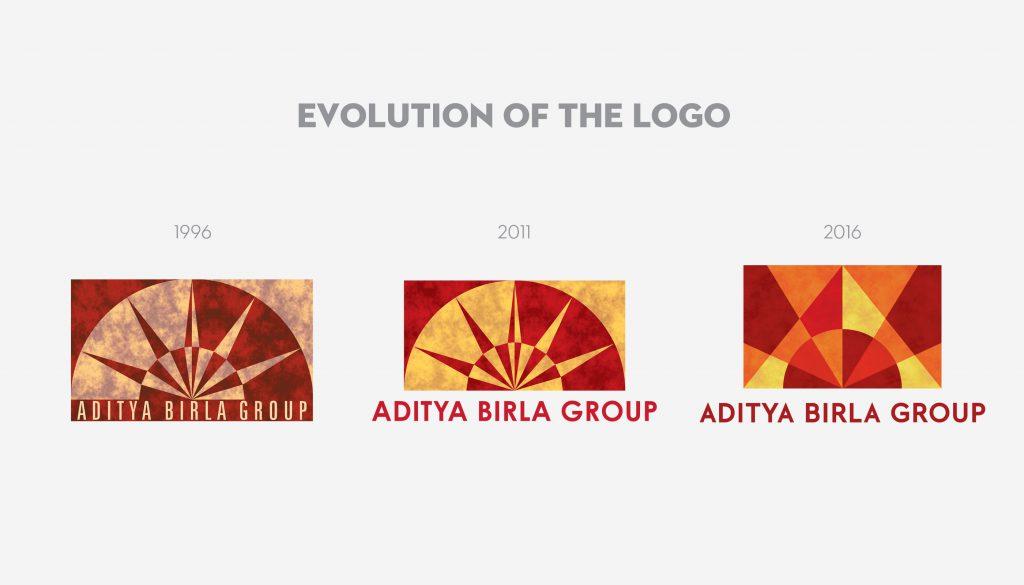
Aditya Birla Group commenced its brand journey in 1996, and its corporate logo underwent three major changes in over 20 years. Each change served a purpose at every stage of the Group’s evolution. The Aditya Birla Group’s current logo depicts the rays of the sun. The dynamic and vibrant colours represent the young population (average of 36 years) that are half of the company’s total strength. The logo is meant to look livelier with deeper colours.
2. Air India

Air India set foot as Tata Air Services in 1932. Over the years, Air India changed its logos as per the alliances that it was joining. The first Air India logo was in the form of a Centaur and was designed with the concept of the Sagittarius zodiac sign. The Centaur can be seen circumcising a circle that represents the wheel of Konark.
In 2007, Air India merged with Indian Airlines, and the new logo depicted a flying swan and the wheel of Konark, placed inside the swan.
In 2014, Air India joined the Star Alliance group, and a new logo was unveiled with only the additional lettering ‘A Star Alliance Member’ under the former logo.
3. Dabur – Ayurvedic medicine and health company

Dabur India’s logo is a modern take on the 100-year-old brand with the Banayan tree. The tree represents a symbol of nature. The tree’s trunk mirrors the form of three people with raised arms. The broadness of the trunk denotes stability, and its multiple branches represent growth.
4. India Gate Rice
India Gate is the world’s largest rice miller and export to nearly 82 countries. Named after the famous architectural monument in New Delhi, the photo is prominently on the face of its pack.
5. Taj Group – Hotel and Resort
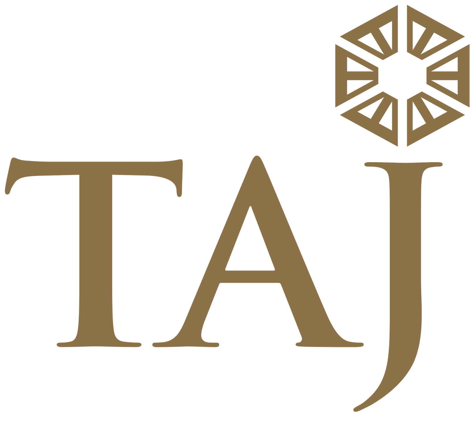
Taj Hotels, founded in 1903, is a part of the Tata Group. The emblem combines the sun with the Taj dome. It represents a fusion of India’s hospitality traditions and rich heritage.
6. Tanishq – Gold and Diamond Jewelry
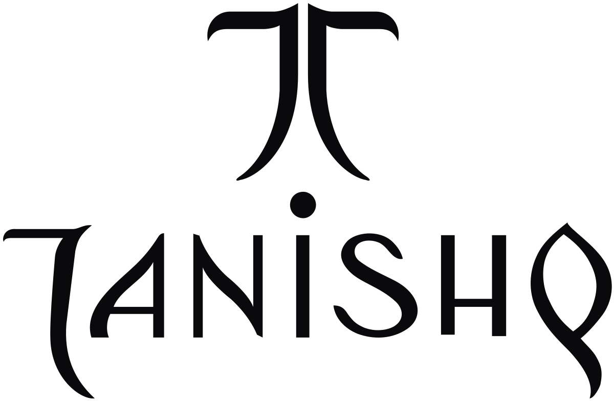
The company’s name is a culmination of ‘Tan’ meaning body and ‘Nishk’ meaning a gold ornament. The curved lines in the logo represent a tree and depict the beauty of Mother Nature as well as strength.
7. Reliance Industries – Jio
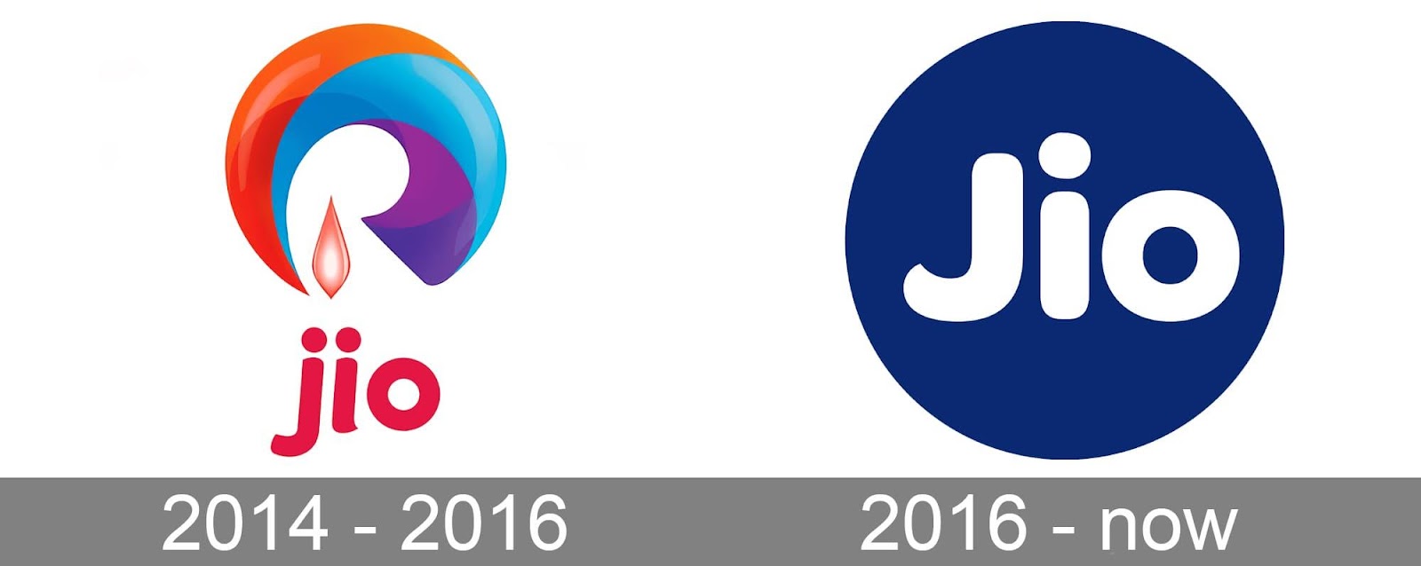
Since its incorporation in 2014, the brand Jio has had no traces of Reliance in it. However, when observed closely, the logo tells us a different story. Reliance was initially an Oil company. And the term ‘Jio’ is just a mirror image of the word ‘oil’. However, the older logo reflected the Reliance journey from a petroleum and oil company into the world of telecom.
Conclusion
Every brand puts careful thought into its logo design, and there is a hidden meaning behind each one of them. These brands have become iconic over the years due to their strong branding and marketing strategies. Litmus Branding, a logo design firm in India helping businesses to get the best brand logo design ideas for their branding and marketing strategy.